Students at Humboldt State University in Arcata, California, have conducted a detailed study of derogatory comments made on Twitter. The students compared the negative uses of words derogatory to gays, ethnic minorities, and disabled people to the population in a given county.
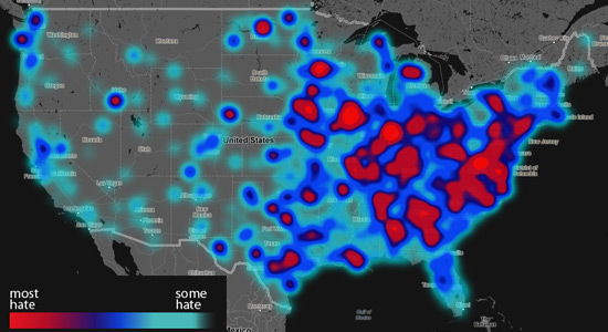
The “Geography of Hate” project produced a series of color-coded maps with light blue indicating areas where the use of hateful tweets was low. The maps colors go to darker shades of blue, then purple then red. The brighest reds are where the use of hateful tweets was the highest compared to the county’s population.
For tweets that used the word “nigger” in a derogatory manner, much of the eastern part of the United States was red. (See the map below.)
More maps and information can be viewed here.


CONGRATULATIONS ON A STELLAR PIECE OF RESEARCH. PUBLISH THE RESULTS WIDELY AND SPARK A DEBATE.
ED