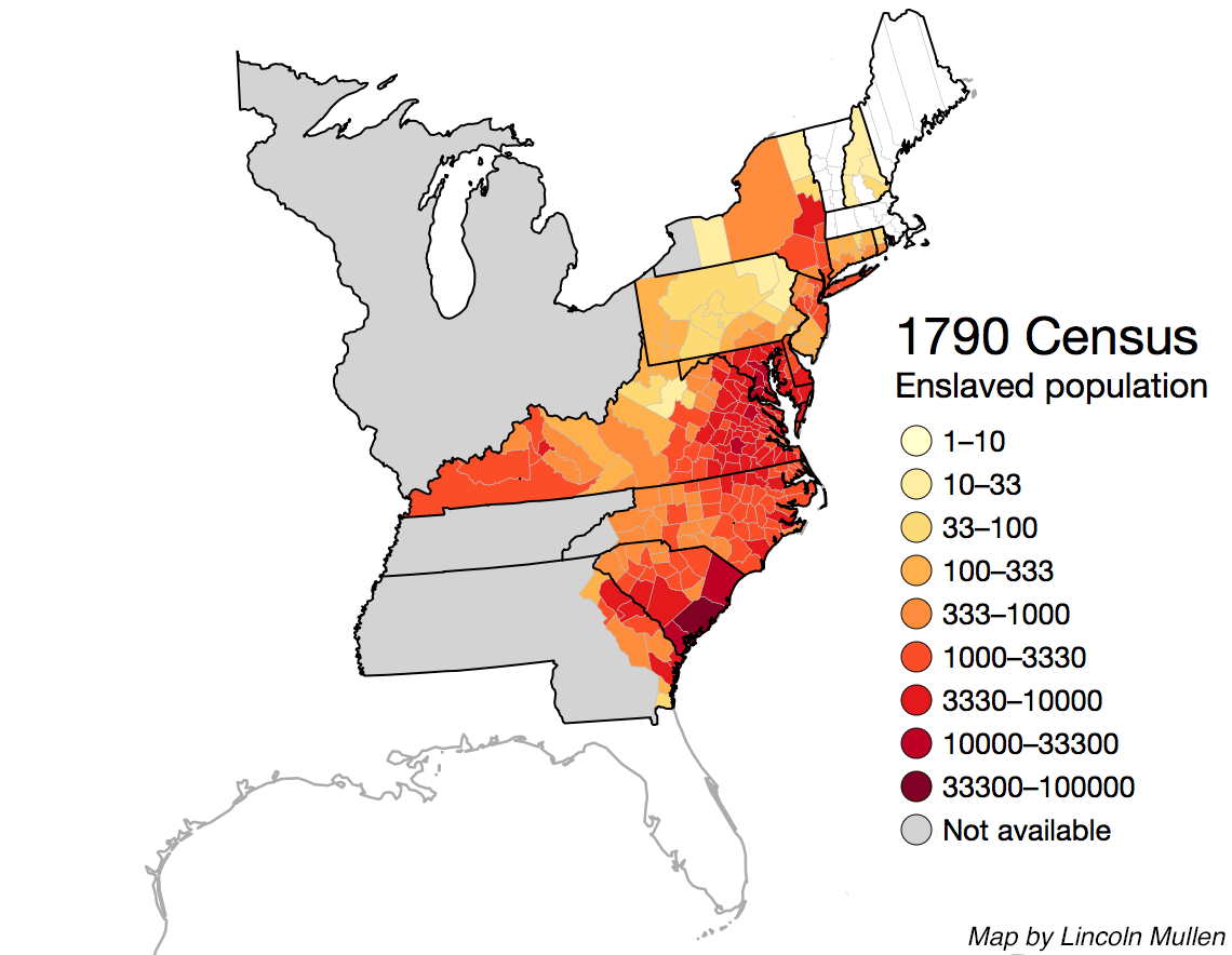
Lincoln Mullen, an assistant professor of history and art history at George Mason University in Fairfax, Virginia, has developed an interactive map that documents the spread of slavery in the United States from 1790 to 1860.
Using U.S. Census data, Dr. Mullen created a map which shows how many slaves and free persons of color there were in each county in the United States at the time. Users can click on any county for the specifics of the particular county. The map is color-coded to show counties with the most dense populations of African Americans.
By going to each subsequent decade following 1790, users can see how slavery spread throughout the South and into new territories and how it gradually ebbed in the northern states. By 1860, Black slaves were more than 90 percent of the total population in several of the counties along the Mississippi River in Mississippi.


